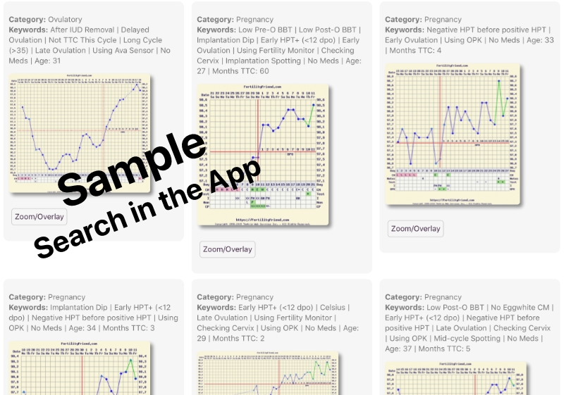
Explore fertility chart patterns and compare your own to the community.
The Chart Gallery is a unique tool that lets you explore real fertility chart patterns and compare your own data to the community. It's also a great way to search for specific conditions and situations such as PCOS, endometriosis, and more.
Extensive Keyword System
When community members submit their charts to the gallery, they tag them with keywords that provide context beyond the recorded data. This includes age, months trying, and specific conditions. The keyword system helps you find charts that match your situation.
Powerful Search
The Chart Gallery offers detailed search capabilities. Filter by chart type, age range, months trying, specific symptoms, and conditions. The "Charts Like Mine" feature finds charts that closely resemble yours, making it easy to explore similar patterns and situations.
Statistics
Each search displays a bar graph showing the distribution of matching charts by category: pregnancy charts, ovulatory charts, miscarriage charts, and anovulatory charts.
Chart Overlay
Overlay your own chart on any gallery chart to visually compare patterns and spot similarities and differences.
How to Access
To access the Chart Gallery, log in to the app (web or mobile) and tap More > Community > Chart Gallery. To use Charts Like Mine, tap the button below your chart.

